
Alape
Brand positioning in constant flux
Alape combines classic manufacturing expertise with exceptional pioneering spirit in product development. Since 1896, the traditional German company has been designing and manufacturing washbasins and washstands made of glazed steel. it continues to pursue the highest standards of material, form and function. When we took over Alapes' brand management in 2015, the task was to translate the manufacturer's brand values into a contemporary communication concept that could be flexibly adapted while always setting new accents.

Visual identity: Same same but different
Alape's visual identity is based on a basic visual vocabulary that is characterized by the same clarity and precision as the products of the manufacturer. In cooperation with the client, we first analyzed the brand values in detail and then transferred them from the product level to the communication level.

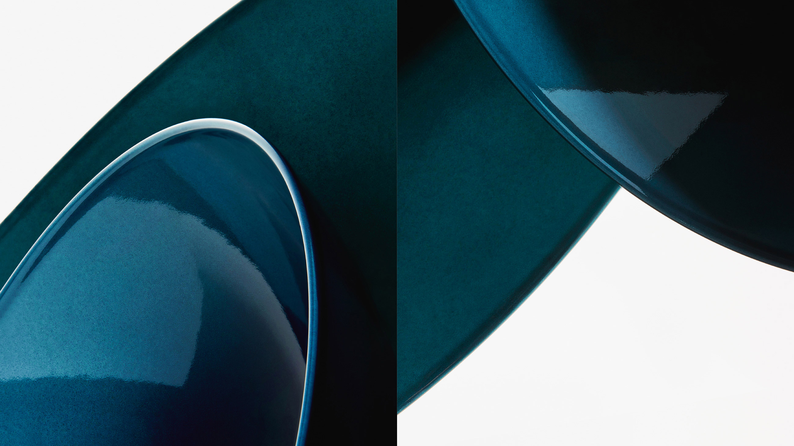
Stylistically well-defined, Alape's visual language offers astonishing agility with regard to different applications.
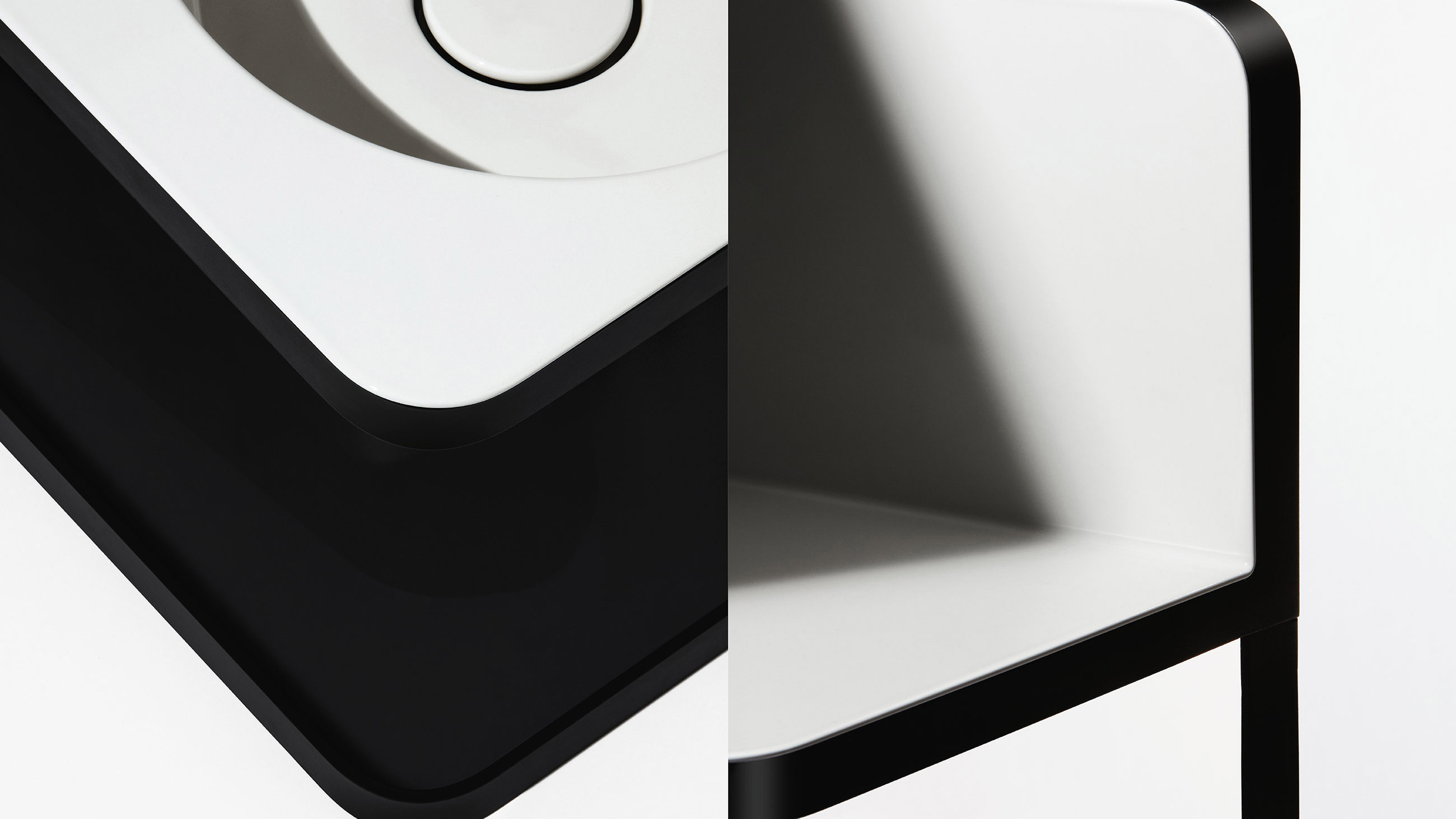
Brand photography must not only be distinctive, but also flexible. Each format brings specific requirements, each type of product requires a different focus, and new details need to be put into perspective in each photograph. While we work with different photographers and stylists who enrich the brand and make it more vibrant, Alapes image aesthetic remains cohesive and recognizable.
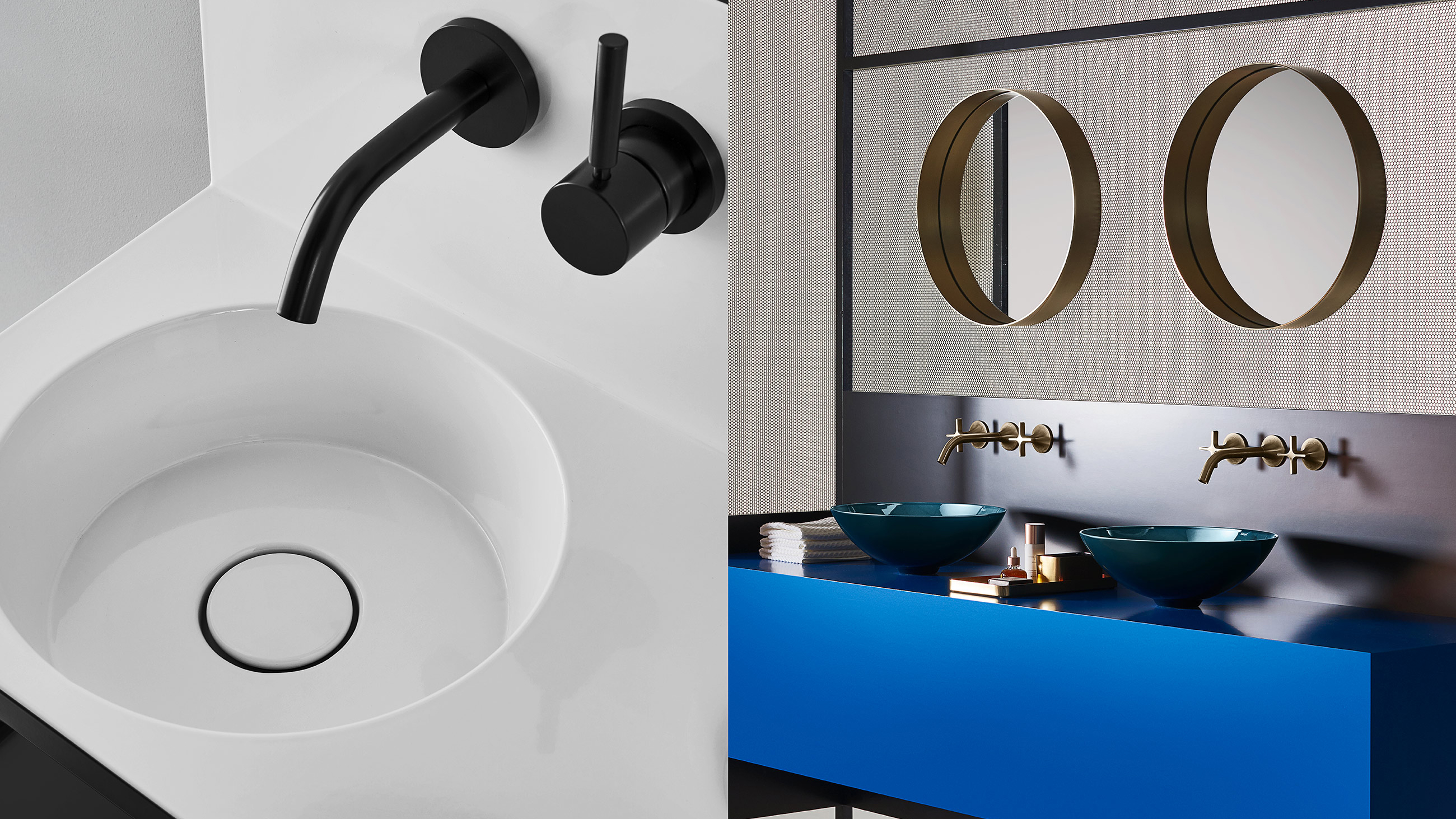
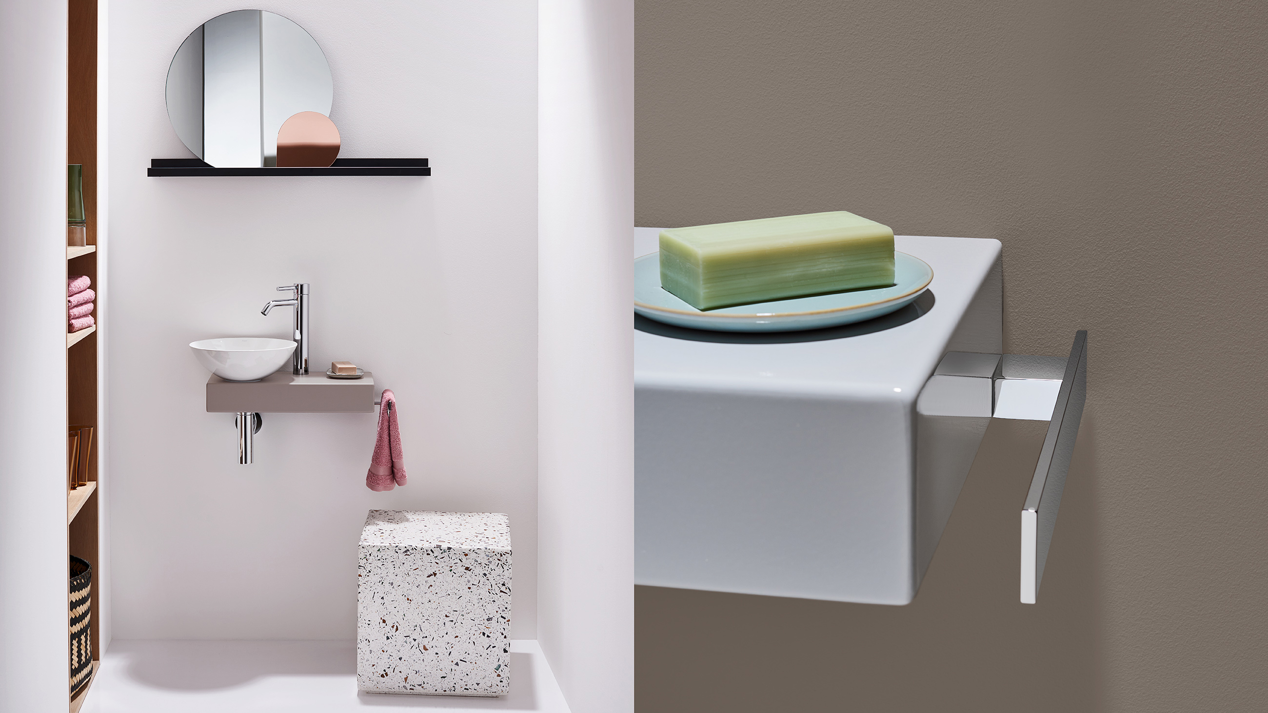
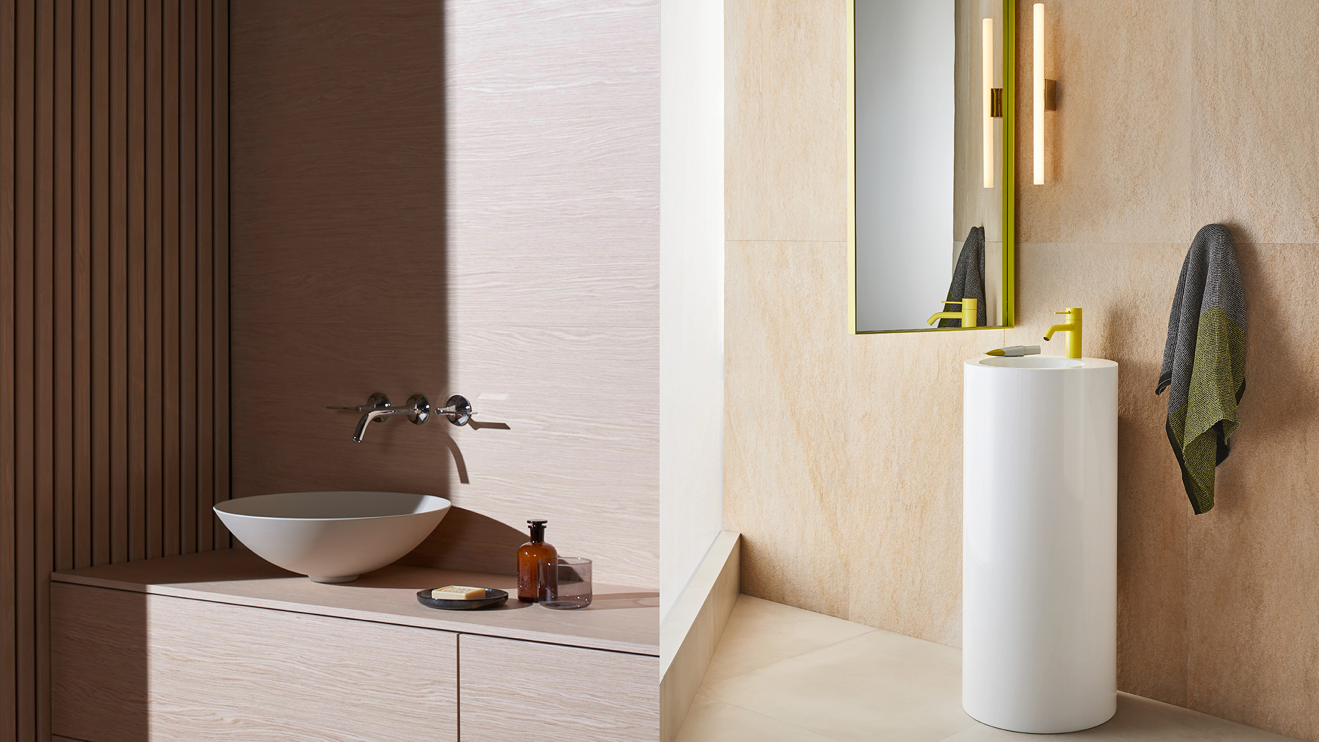
Each format has special requirements, and for each type of product the visual language must set different priorities.
Whether it's classic catalog images, abstract still lifes within an editorial, or social media channels:
»Alape's distinctive visual language provides stylistic continuity across a wide range of media and applications.«
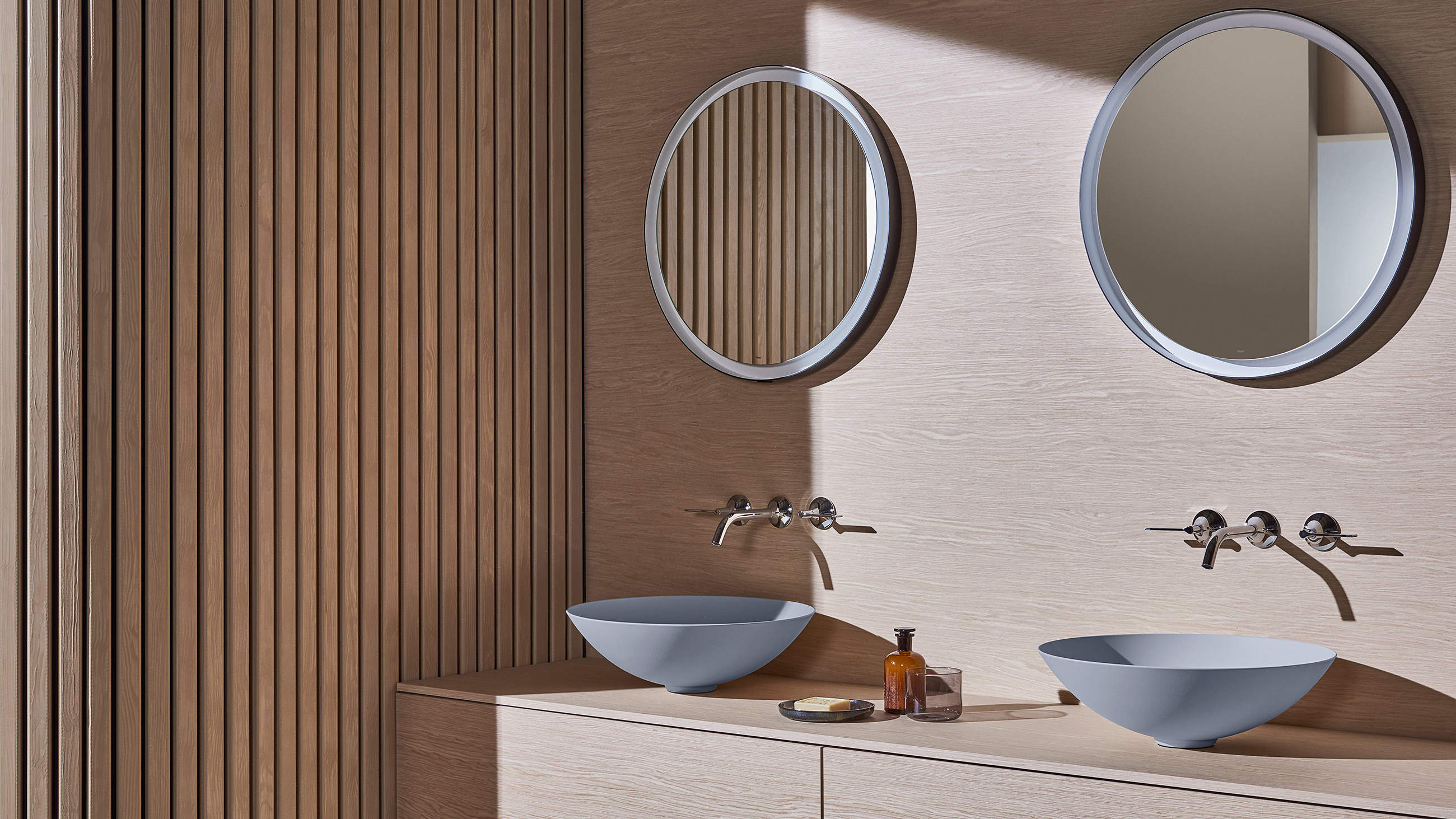
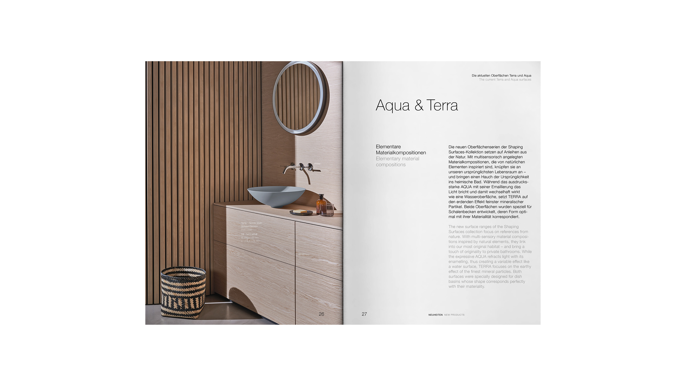
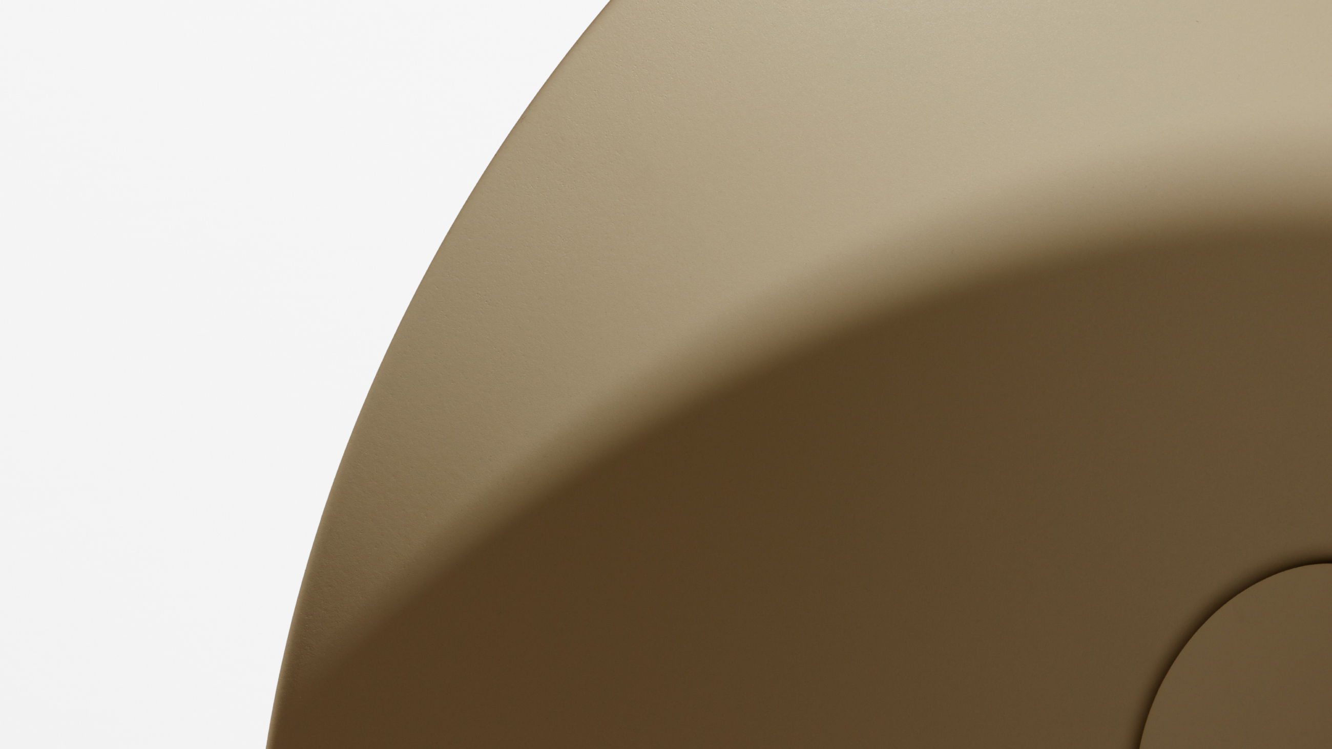
Shaping Surfaces: A subbrand that focuses on sensuality
Holistic brand support means strategically accompanying the evolution of the customer and constantly thinking ahead. Accordingly, new concepts are constantly being developed under the roof of the brand. Like the modular products of the manufactory, Alape's individual media building blocks are designed in such a way that they stand for themselves just as effectively as for the big picture.
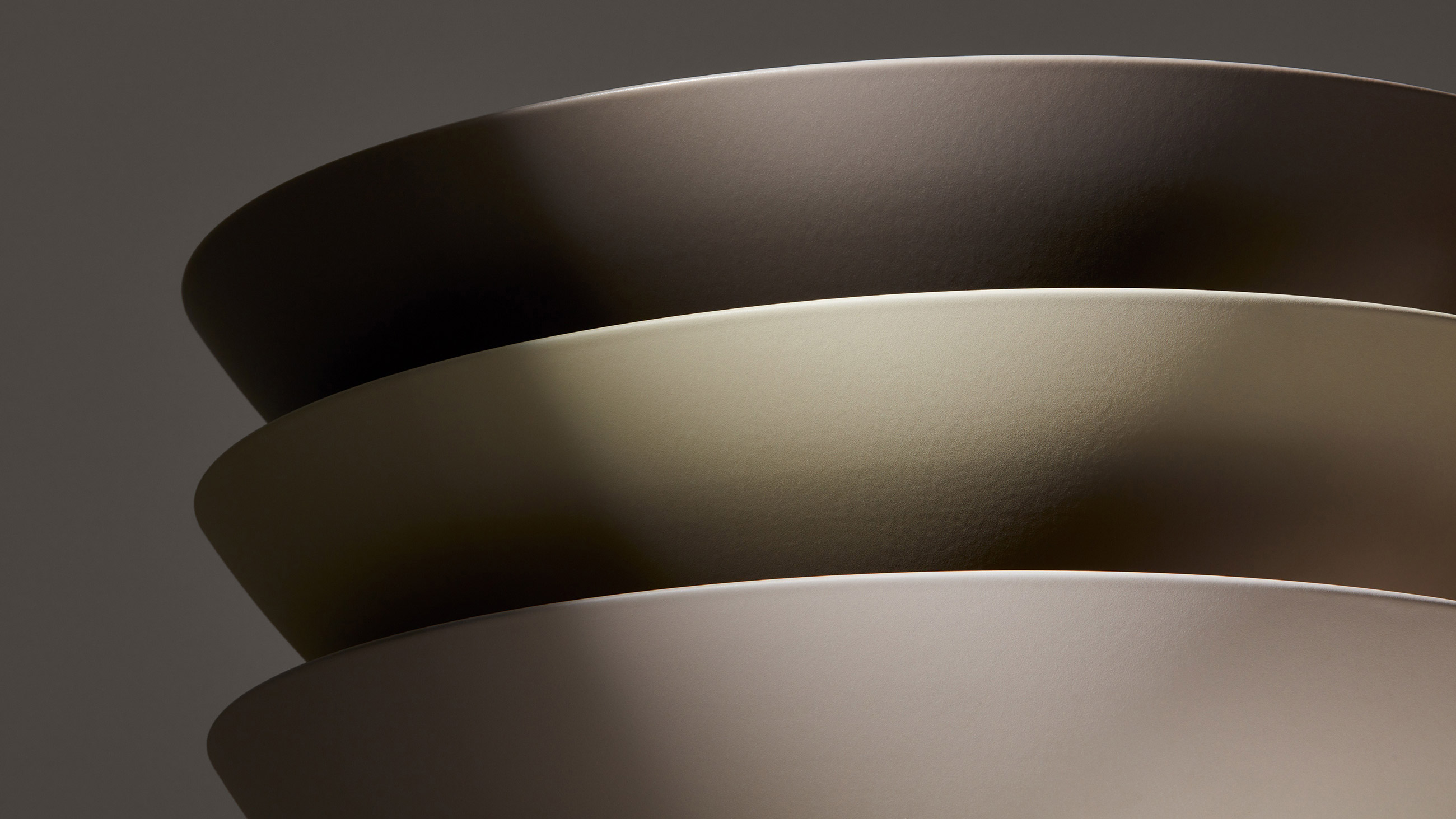
Alape's curated "Shaping Surfaces" product series speaks a poetic language inspired by nature - just like the special basin surfaces in the series. The verbal tonality continues visually.
Definition: Naming and strategic realignment
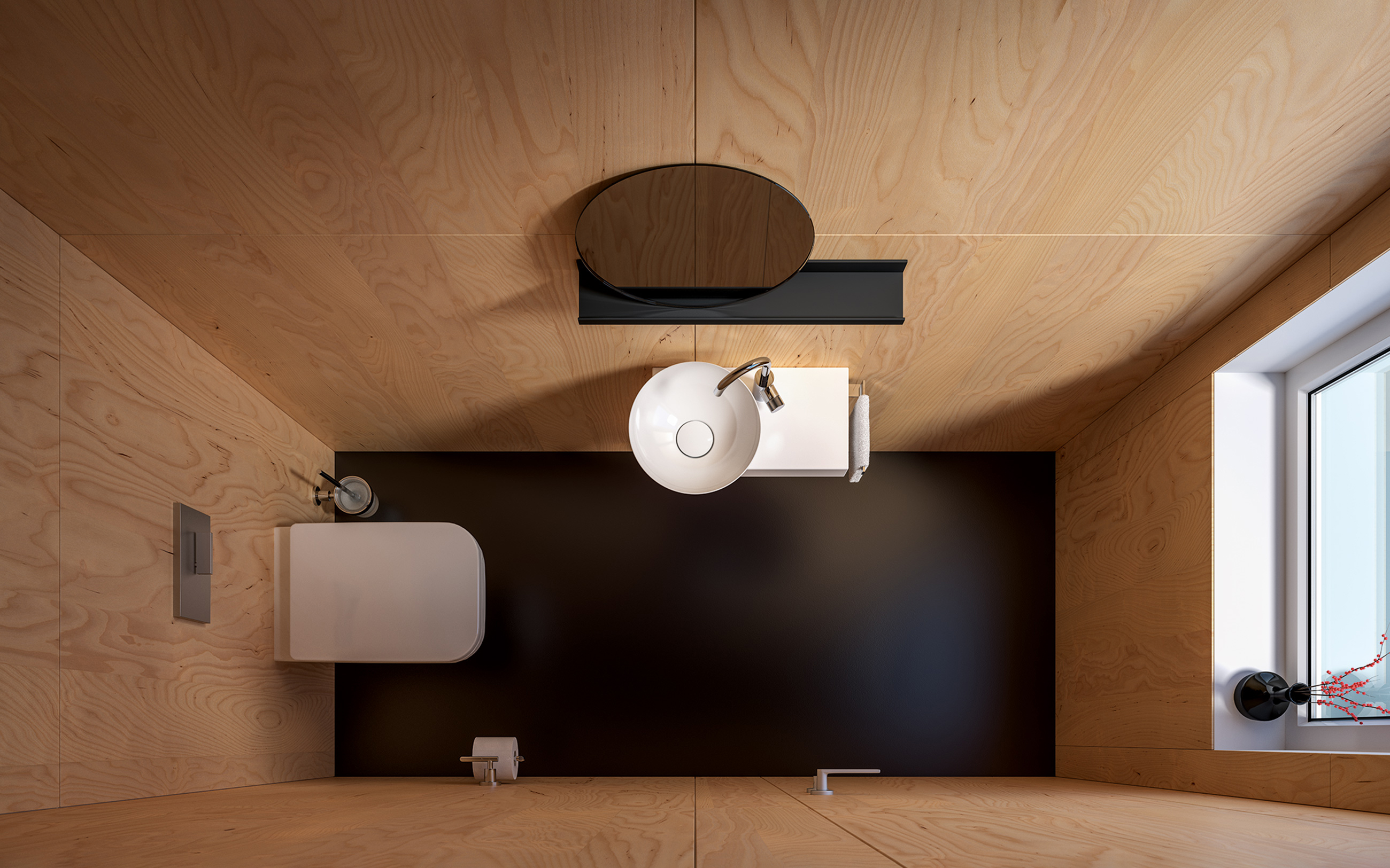
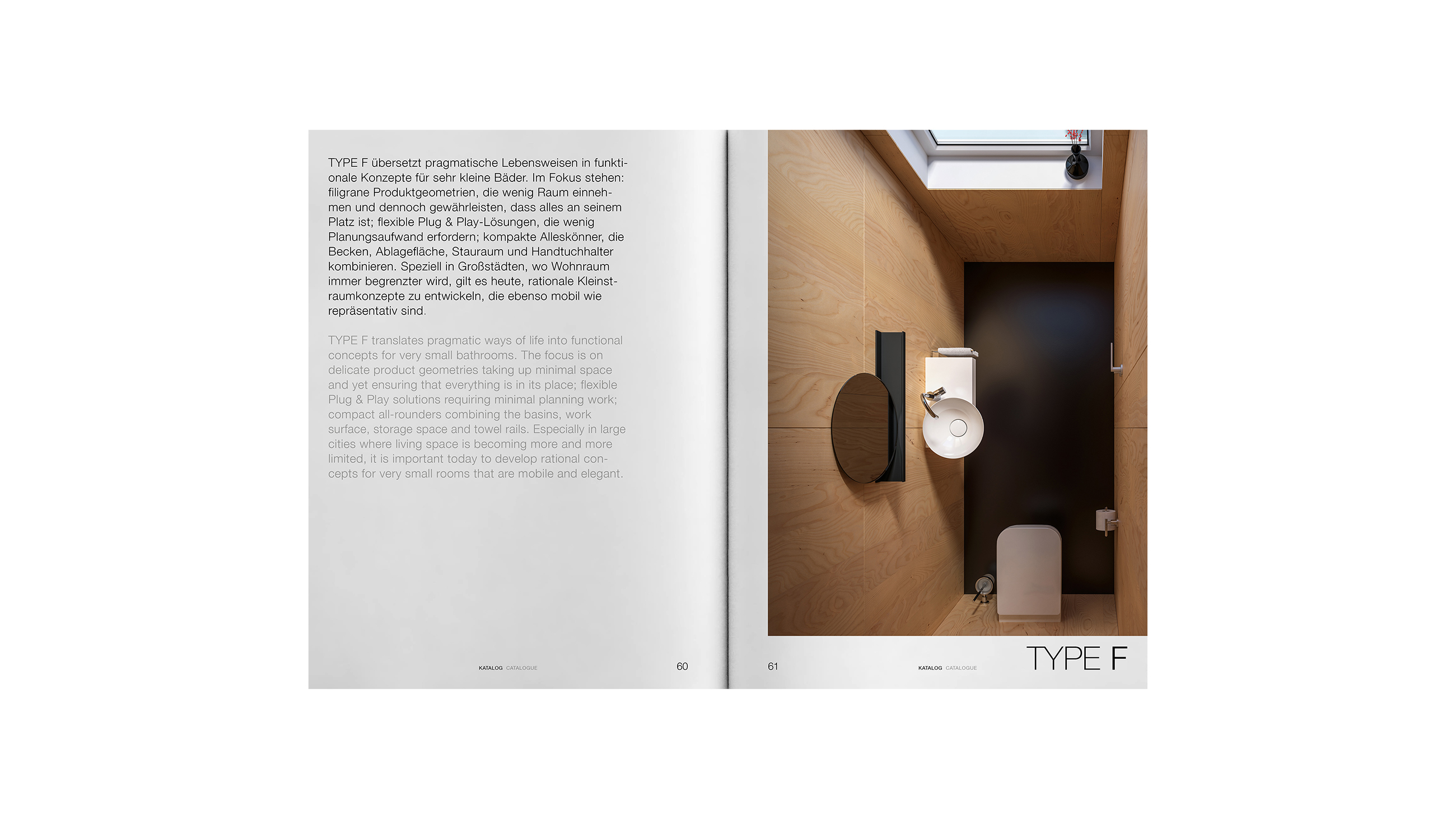
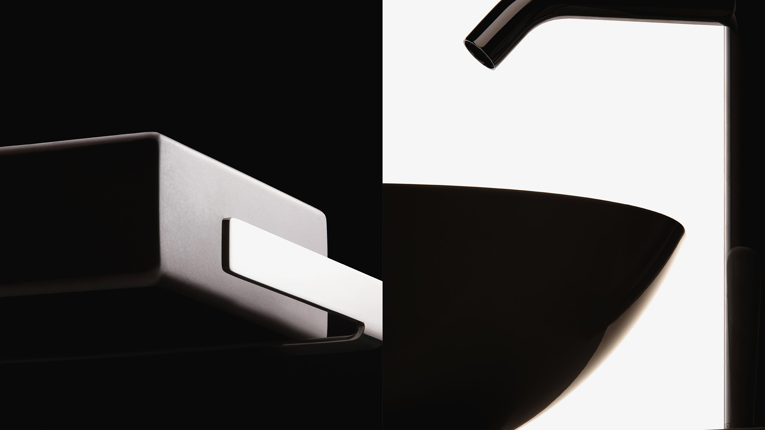
Definition stands for concise composition. To reposition Alape's micro bathroom product category, we highlighted the planning expertise that is at the forefront of kleiden bathrooms.
Alape makes it possible to optimally define limited space. In words and images, the language here is technically, especially architecturally inspired. Within the category, the individual building task is specified on the basis of three basic types.
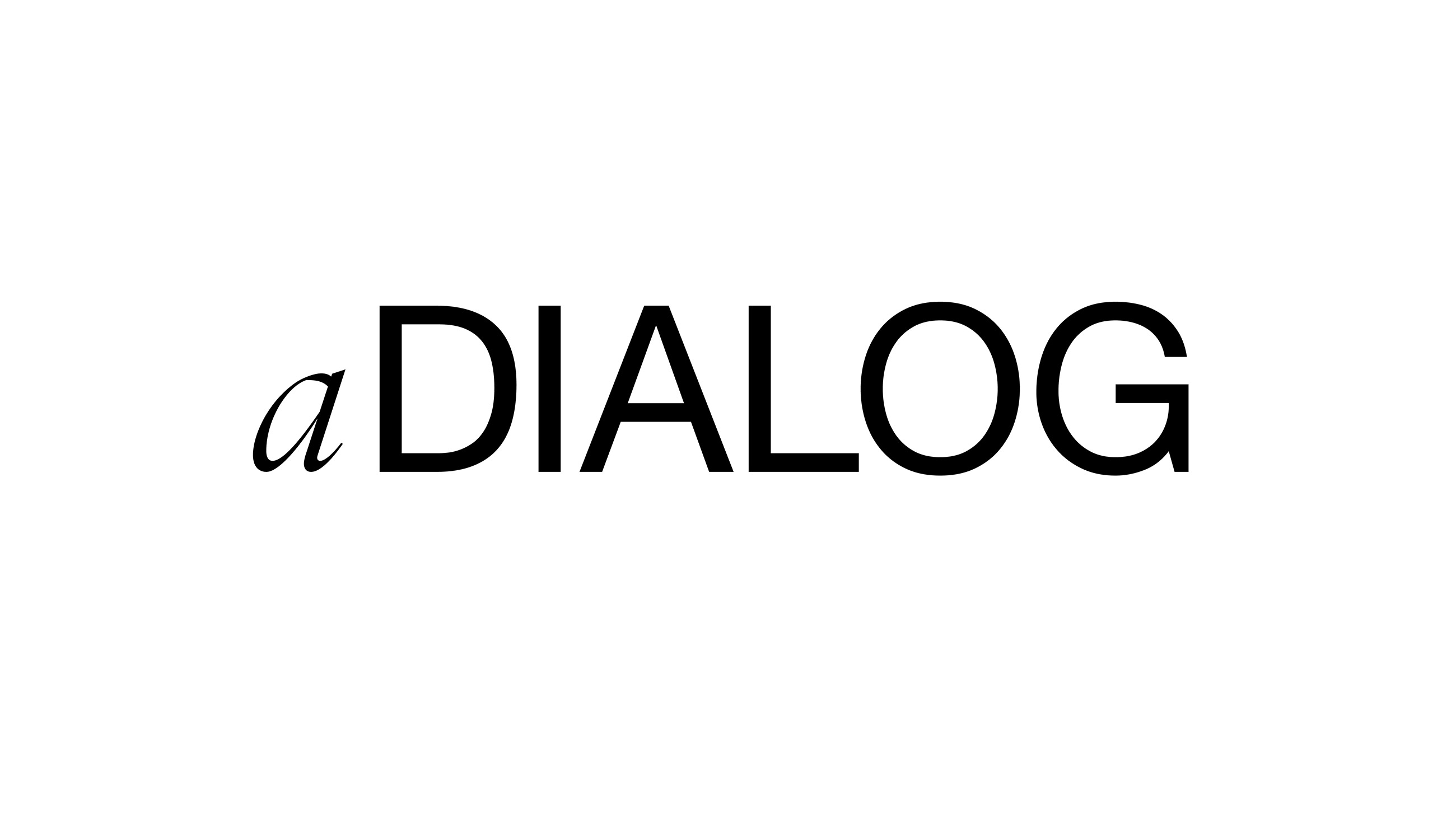
aDialog: Narrative brand extension
In order to offer clients the opportunity to experience their brand in different media, we designed the editorial format aDialog, complete with its own visual identity. As an ongoing series of conversations, aDialog opens up new perspectives, expanding Alapes' brand identity both intermedially and contextually.
The solid capitals of the logo were preceded by a cursive lowercase »a«, suggesting the dynamic nature of the format.
.
Multidimensionality: The brand in the reference space.
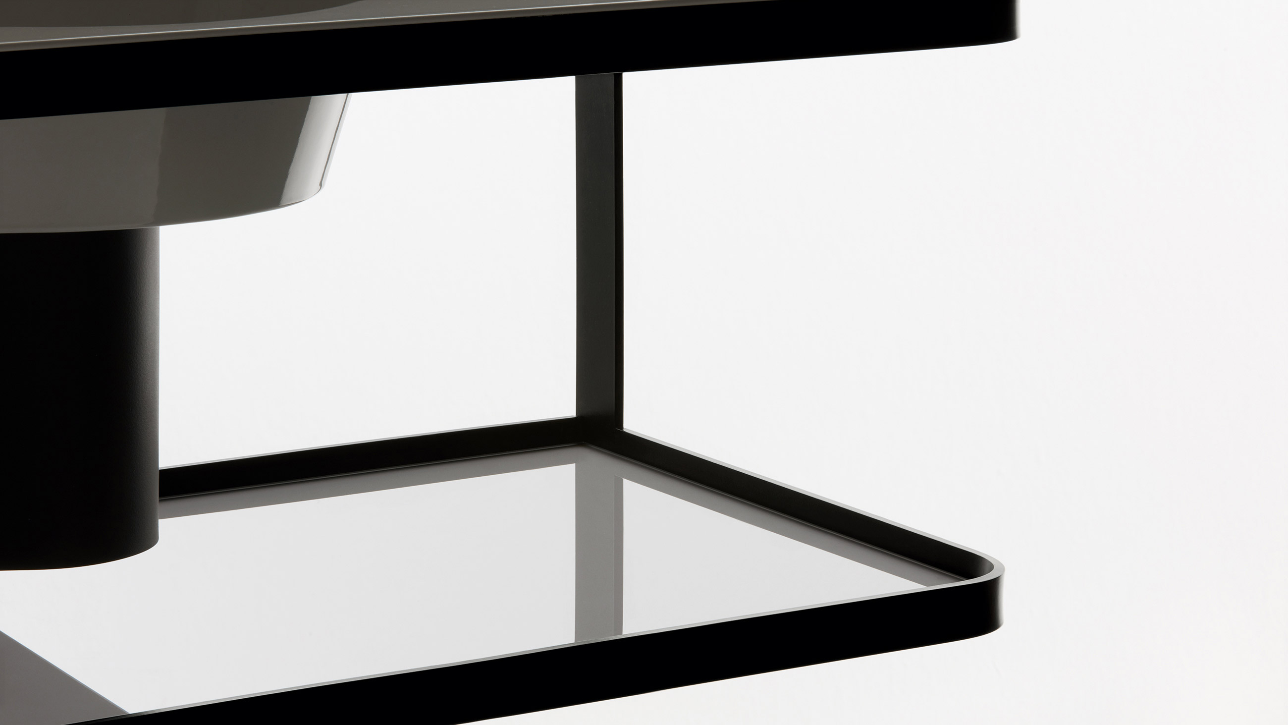
A fundamental aspect that inspired Alape's appearance from the start is the holistic approach of the manufacture.


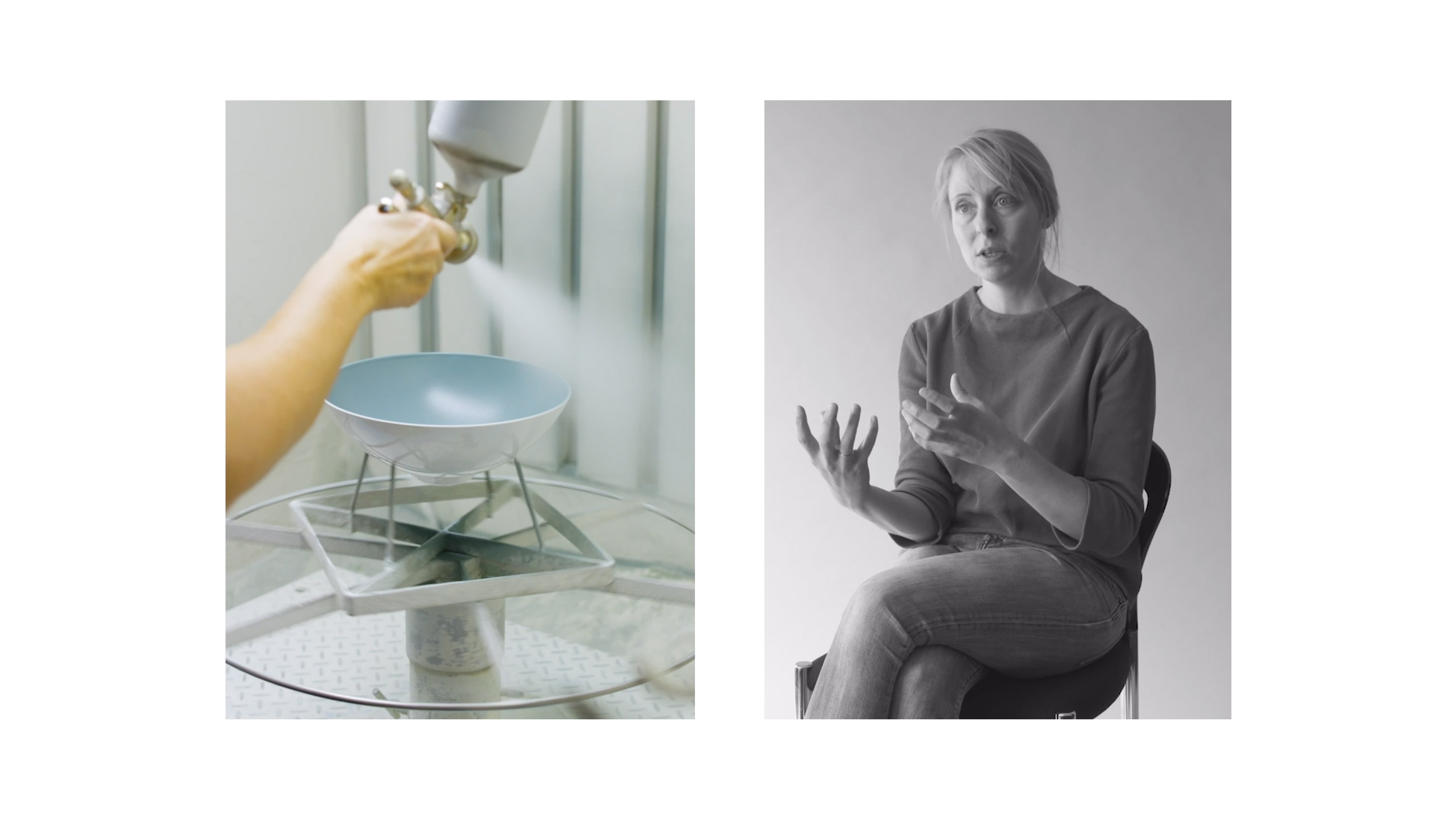
Image film: Communication is composition
Alapes' manufacturing process forms the basis of the brand and its products. To make the poetry of this process tangible, we staged it in an atmospheric image film.


