
Klassik Stiftung Weimar
Between classicism and modernity
With its historic estates, parks and research facilities, the Klassik Stiftung Weimar builds a bridge from Weimar Classicism to modernity. It was therefore all the more surprising that its modern accents were barely represented in the foundations previous visual appearance. Thus we aimed to eliminate this discrepancy through a redesign. The result is an integrated brand that does justice, not only to Thüringens cultural sites, but also to the legacy of their protagonists and their works, which have long since become iconic in their own right, and still continue to influence modern design to this day.
The modular logo: cornerstone of a new brand architecture
In order not to jeopardize the recognized value of the established logo, we did not simply opt to replace its typeface carelessly, but instead, developed it further in an innovative manner. The expandable typographic system that emerged in this way offers each institution an independent trademark that nevertheless continues to clearly communicate its affiliation with the foundation. We opted for a dual tone of Antiqua as the foundation's identifier and a Grotesk font for its individual facilities.


The creative flexibility of the logo system is continued in the color space. As an identifying color, the warm silver tone Pantone Metallic enhances all media with which the Klassik Stiftung Weimar communicates. For events and publications of individual institutions, the classic tonality is replaced by freely selectable colors that correspond optimally with the contents. In this way, the appearance of the Klassik Stiftung remains as varied as the foundation itself.

»As a basic visual bracket, the frame creates continuity and, on top of that, remains itself movable while adhering to certain parameters.«

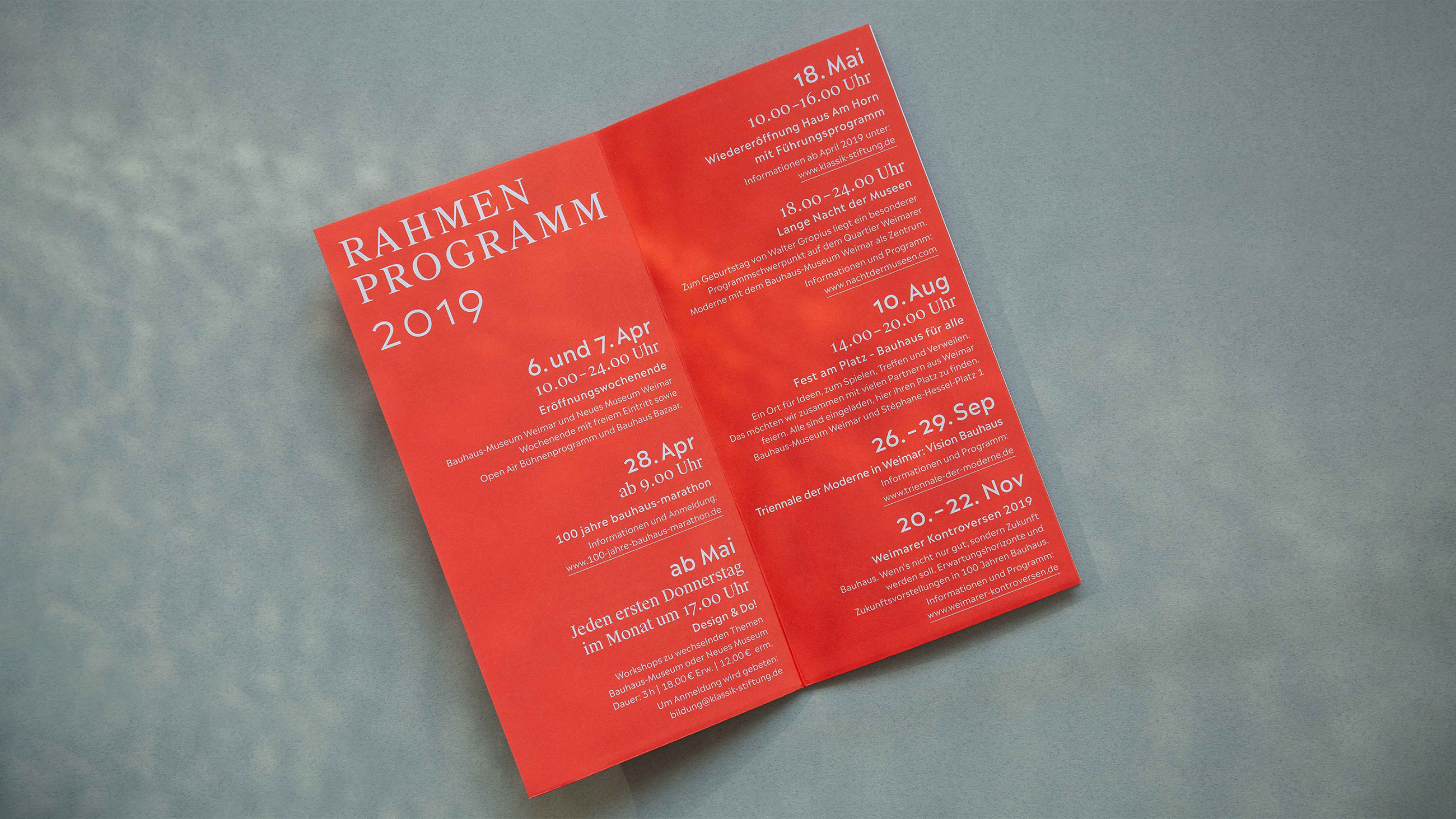
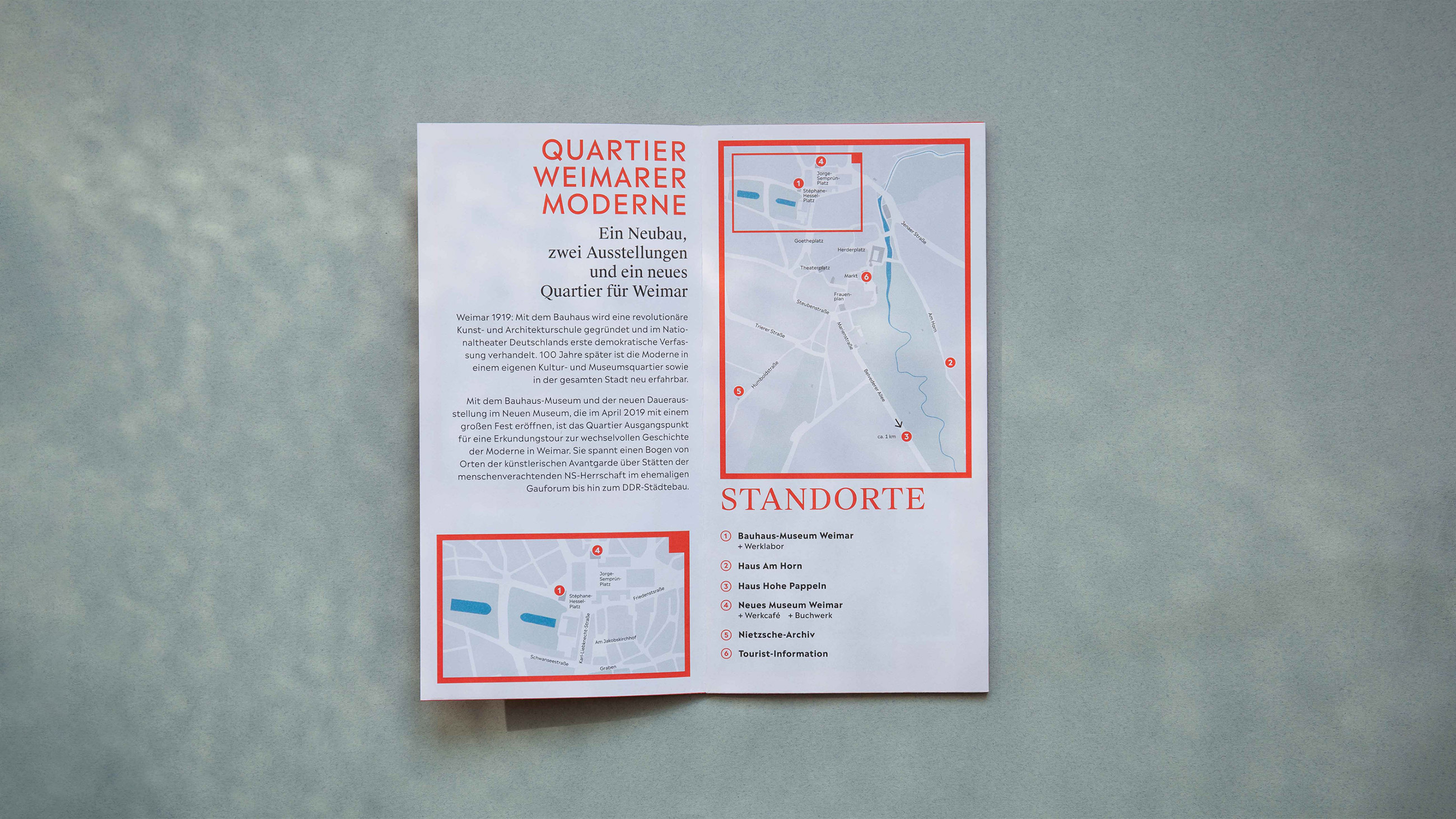
With its numerous houses and programmatic focuses, the Klassik Stiftung has to serve a wide variety of media channels and formats. The variance in the consistently applied communications concept means that its individual institutions are perceived more strongly. This also conveys the scope of the foundation as such much more effectively than was previously the case.


wo campaigns celebrating historic culture - and a new beginning
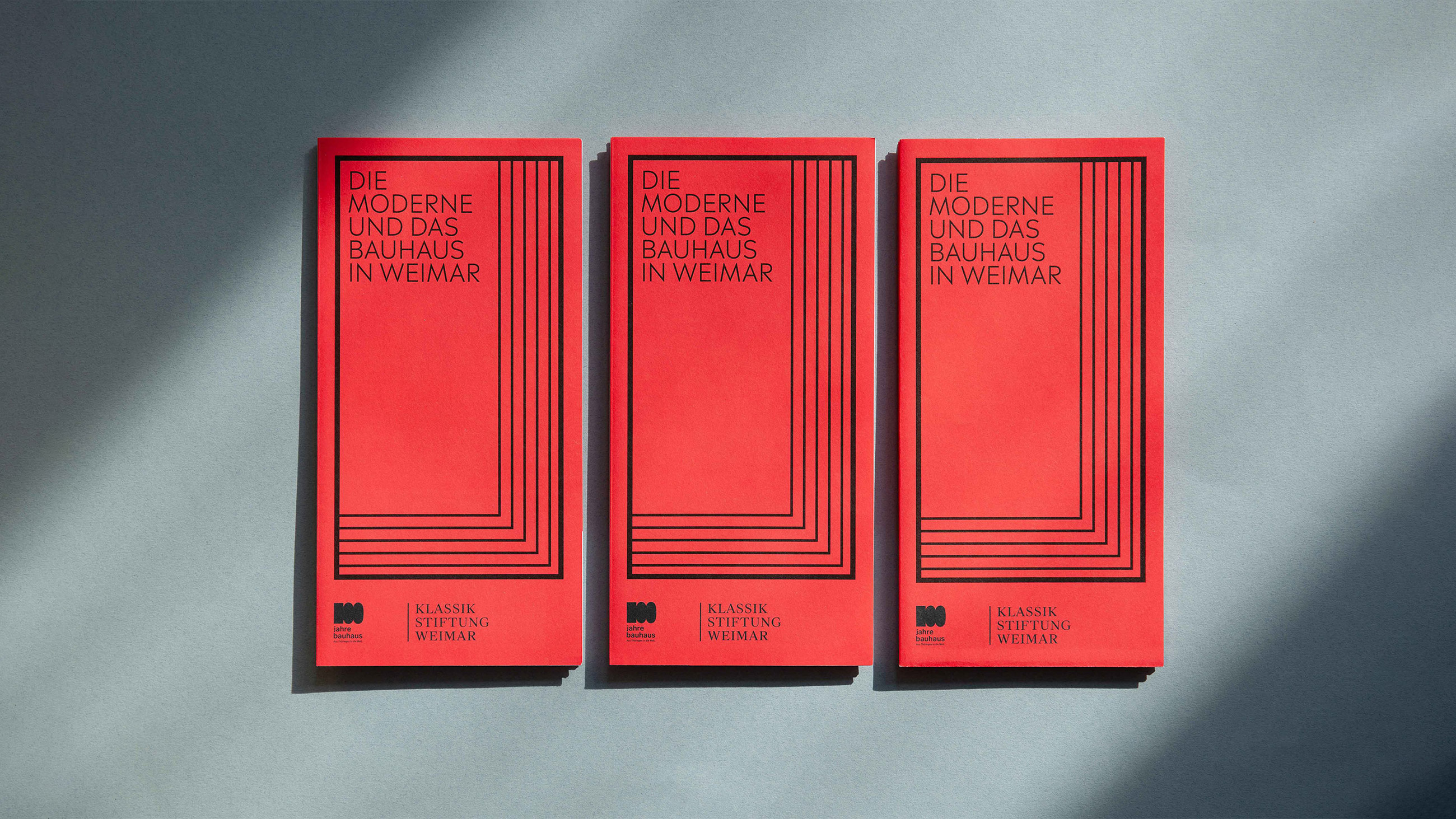
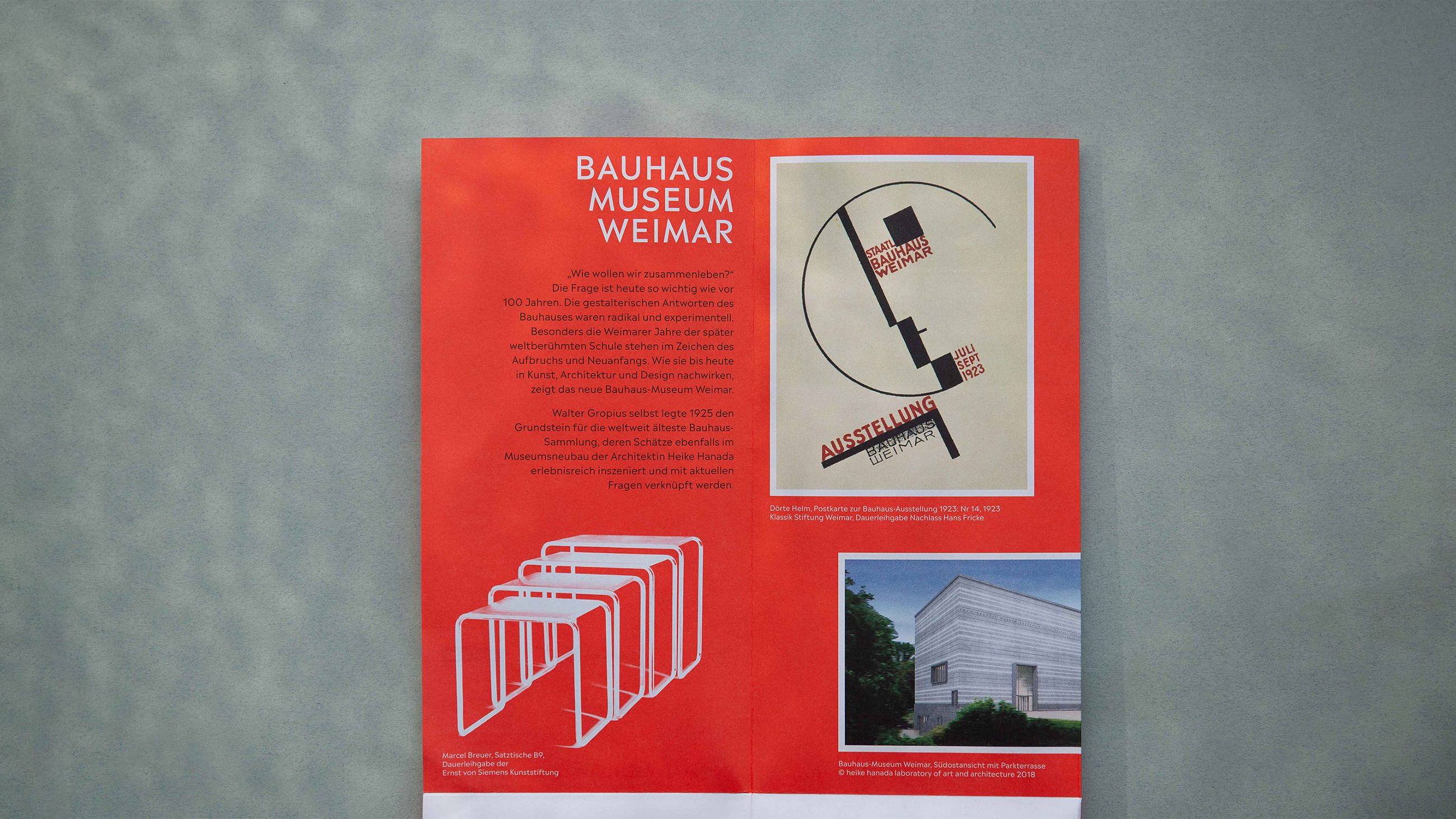
As part of the hundredth anniversary of the Bauhaus, the new Bauhaus Museum Weimar was opened in April 2019. Based on our new corporate design, we created an international opening campaign. The broad marketing measures for the anniversary provided the ideal occasion to unveil the new visual identity for the entire Klassik Stiftung Weimar.
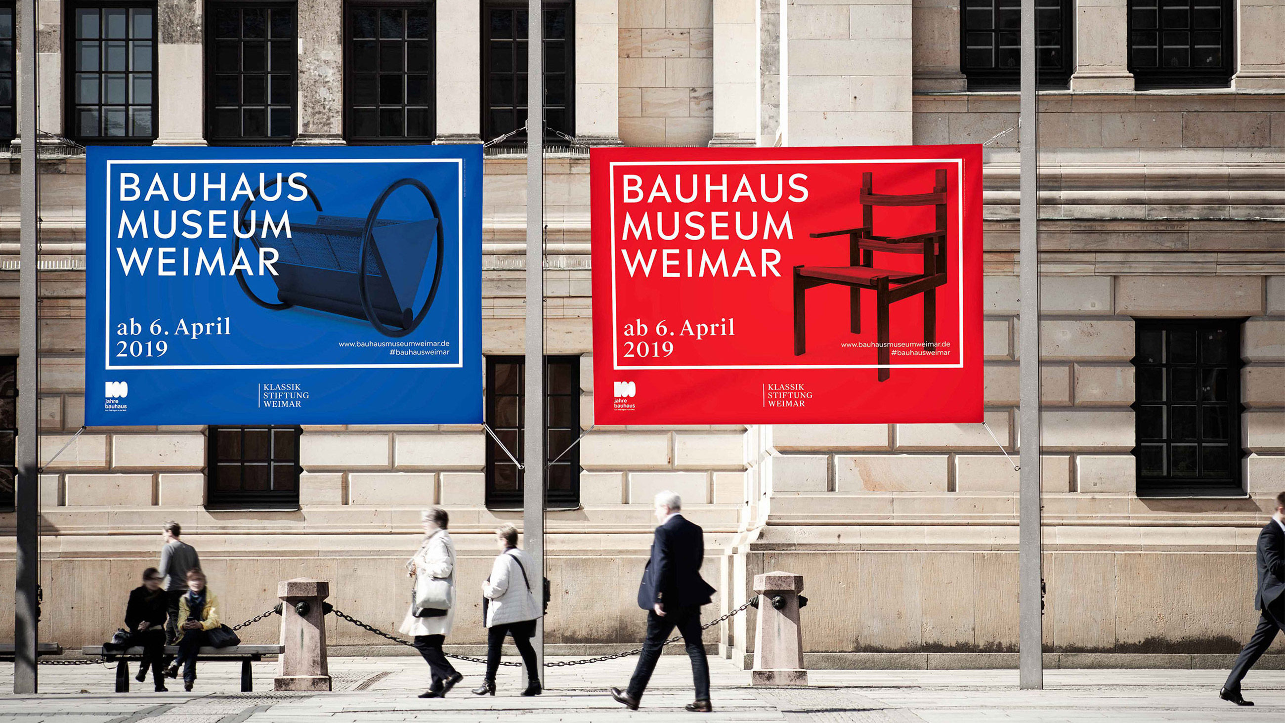
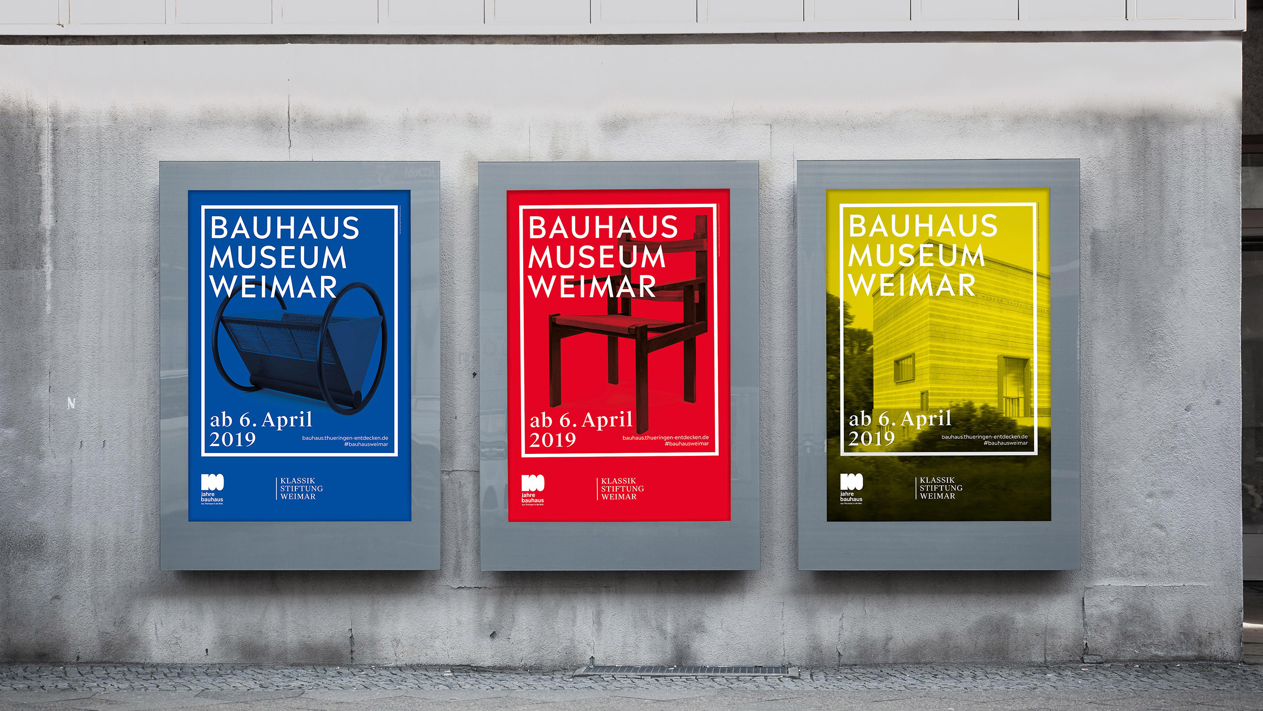

In the three characteristic primary colors of red, blue and yellow, the campaign signals the dawn of modernity. On the visual level, the means of communication are defined by style-defining products and protagonists of the university. Functional in its applicability - and thus in keeping with the Bauhaus philosophy - the campaign established the Bauhaus Museum with a media presence that has an impact far beyond its opening days.


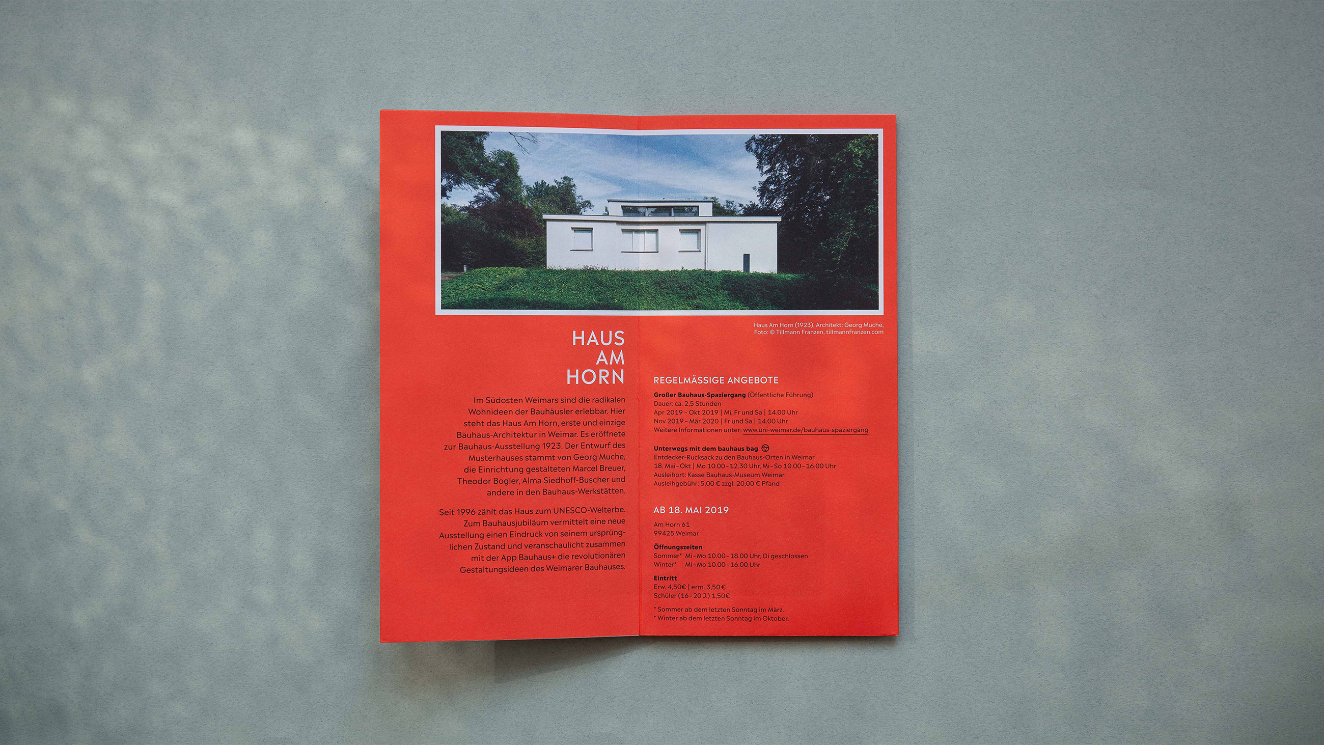
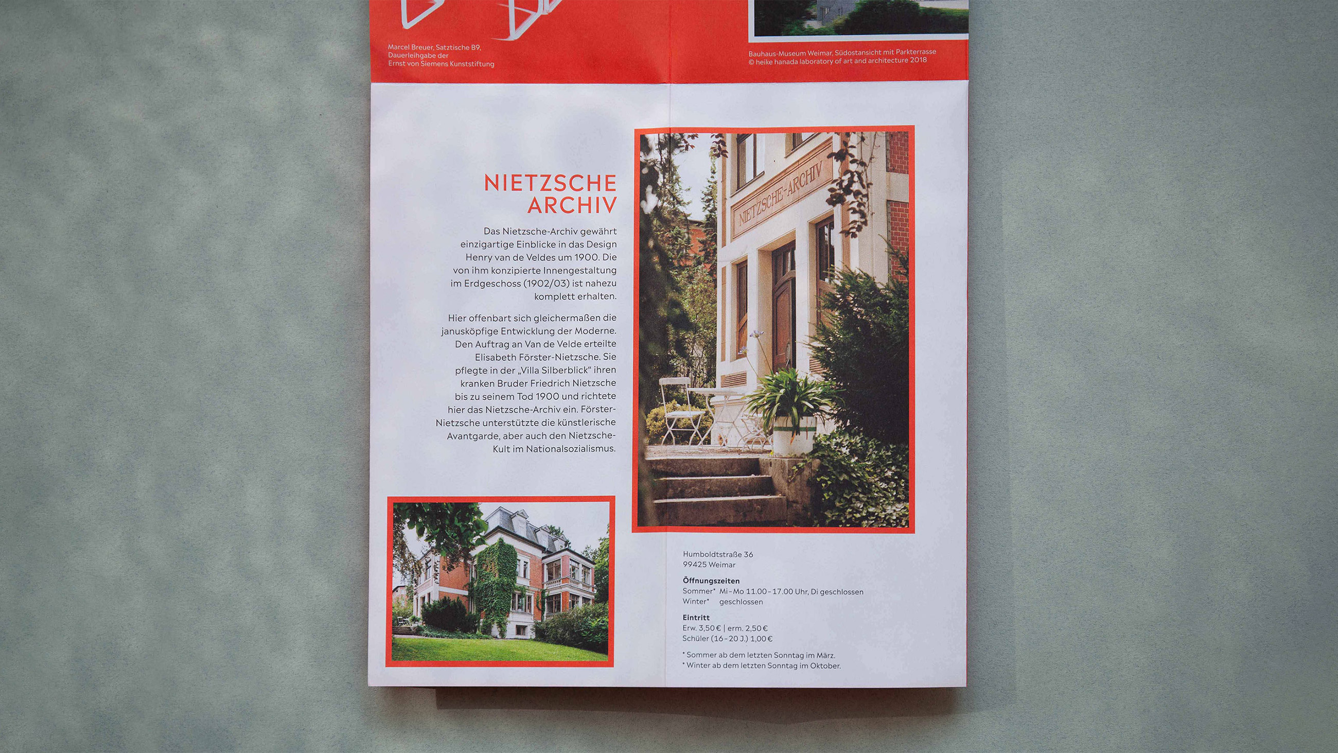
A second event for which the new image campaign of the Klassik Stiftung was used to great media effect, was for the reopening of the Neues Museum Weimar. In spring 2019, the permanent exhibition "Van de Velde, Nietzsche and Modernism around 1900" ushered in the museum's new phase of life. The advertising and communication materials we designed for the museum reflect the splendor of the stylistically diverse era as well as its references to the present.


Klassik Stiftung Weimar