
Futurium
Tomorrow starts today
Futurium, the "house of the future" in the heart of Berlin, needed a stylistically forward-looking visual presence to capture and effectively communicate the house's broad thematic spectrum. The corporate identity, which we conceived in the course of an extensive brand development process, was to be forward-looking without being tied to a concrete vision whose future viability would eventually make itself obsolete.
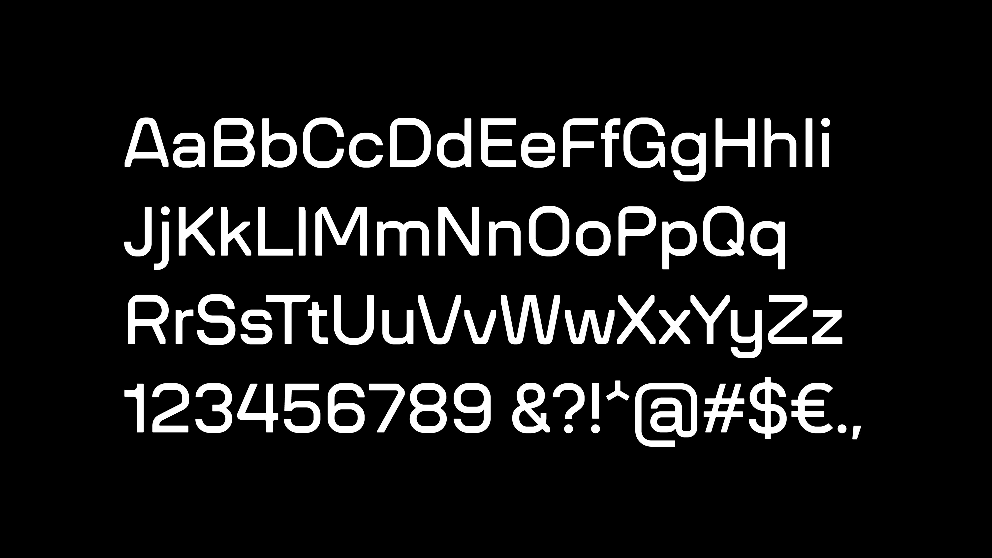
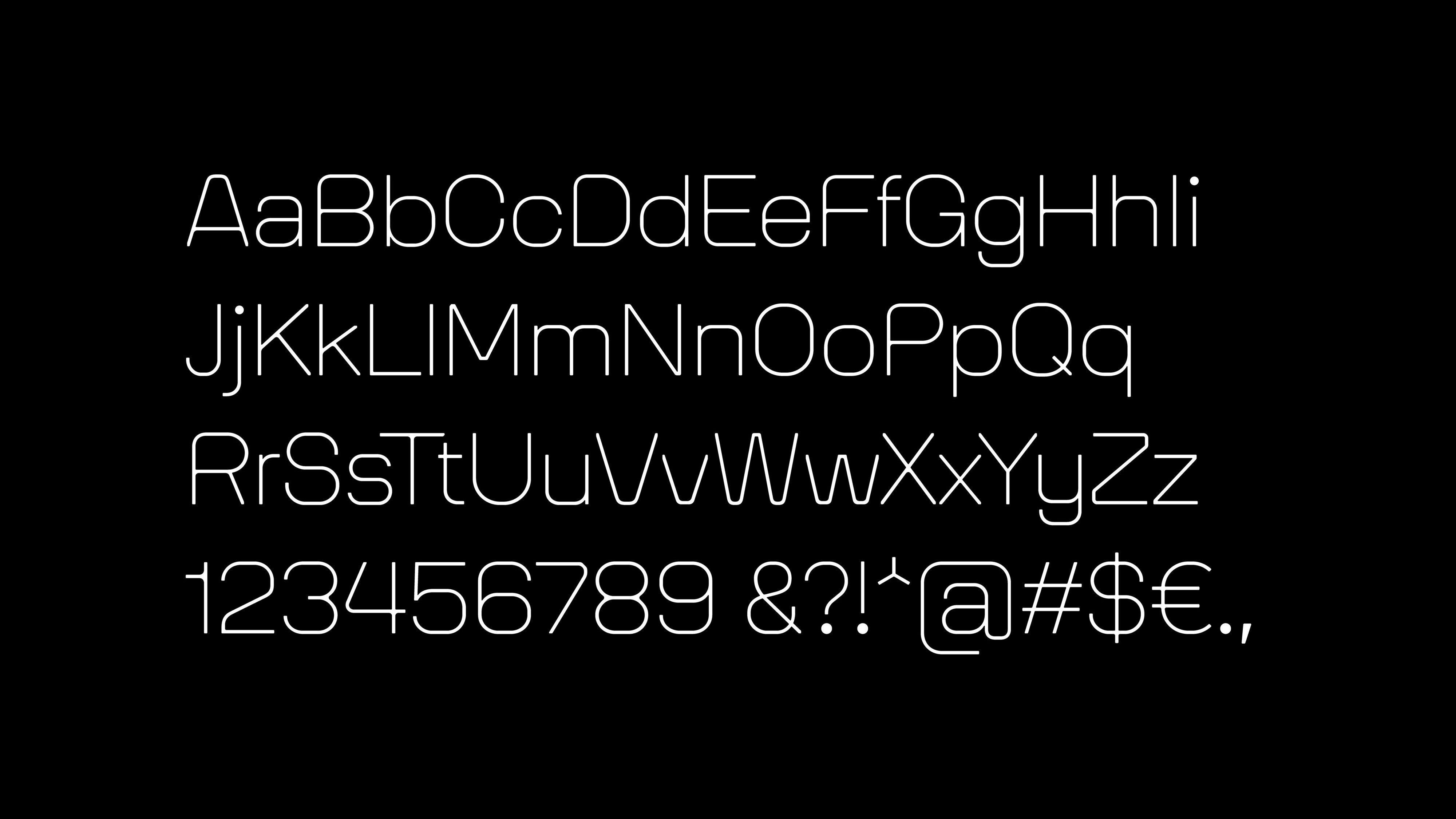
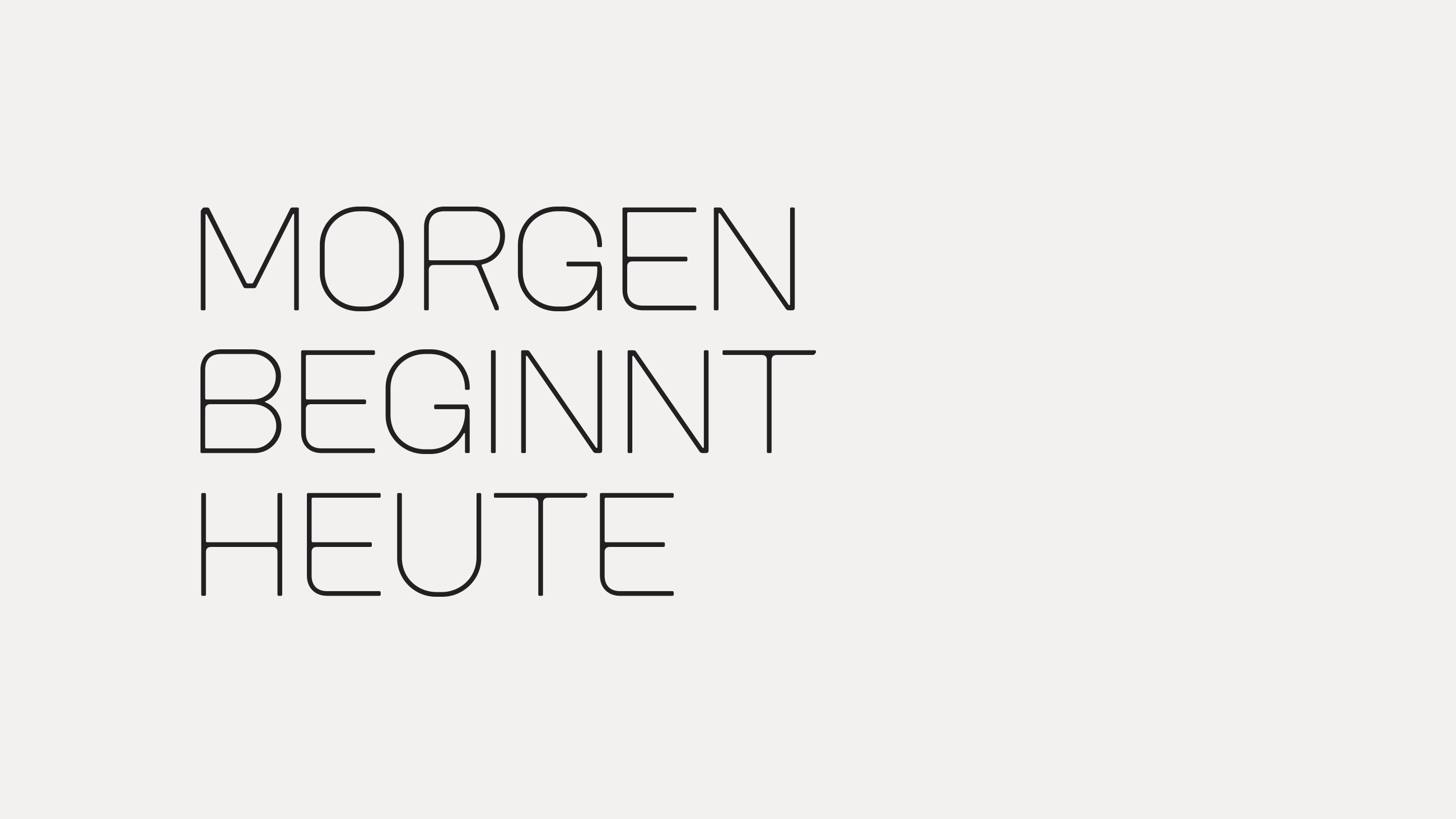
Written Futures: Branding and Futurium Font
With a characteristic logo lettering and the specially developed Futurium house font, we have created a typographic foundation that on the one hand offers mobility, and on the other hand creates lasting points of reference to the building that not only houses the institution, but is also identity-forming in its conciseness.
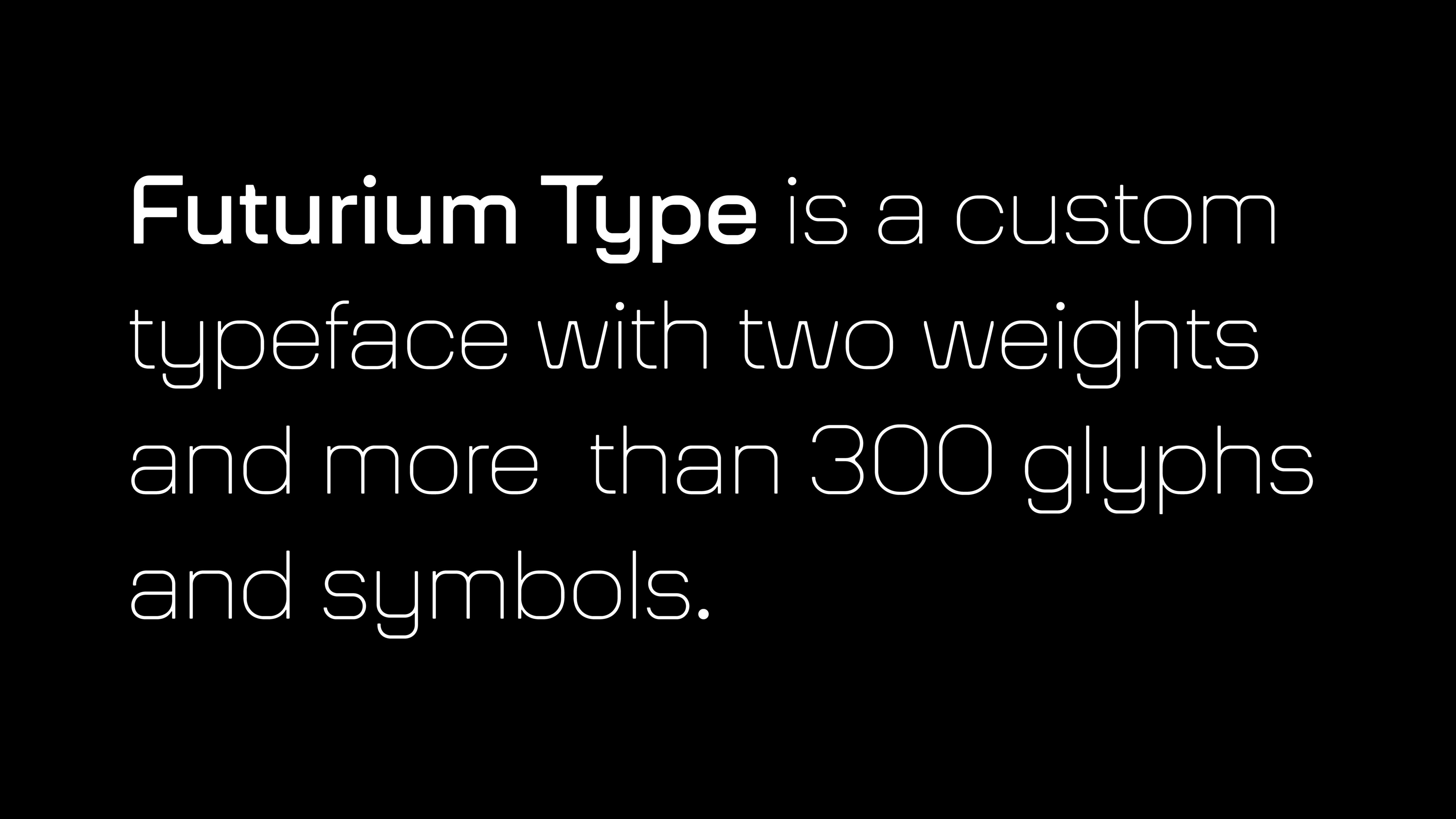
The typographic building blocks that characterize our appearance for the Futurium pick up on elements that were already inherent in the architecture and interior design of Richter Musikowski's design.


Application diversity beyond rigid grids
In the case of the Futurium, we decided to counter the complexity of the curatorial content with a reduced key visual that can be used in a particularly wide variety of ways: Depending on the application and format, the typographic building blocks of the brand are supplemented or replaced by a rasterized area that can be modified within the variable design grid itself.


Futurium not only brings together a wide variety of projects, disciplines and people under one roof, but it also communicates through numerous channels. The variety of classic and new communication tools it uses are held together by a set of graphic elements that can appear in various configurations.
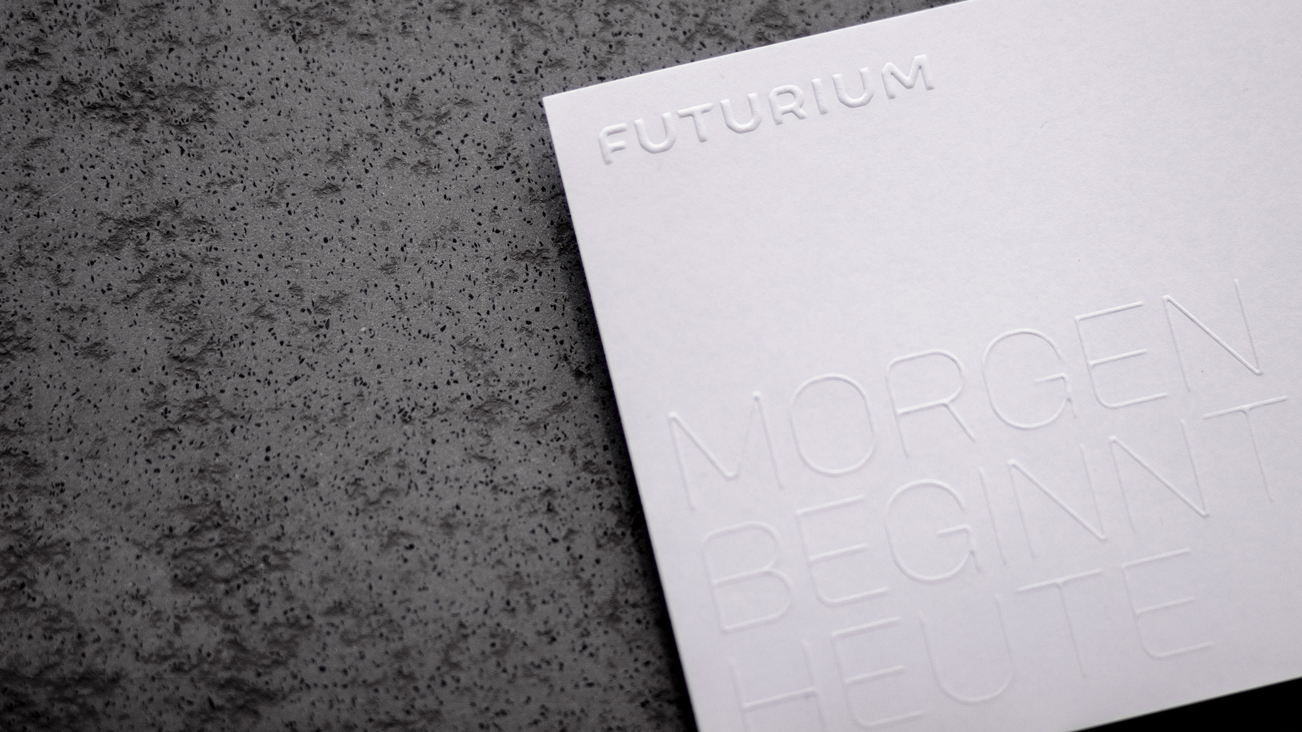
A brand communicates itself most effectively when it uses different levels of communication. A tagline we developed for Futurium refers to the flow of time and reminds us that the future is always closer than we think. Set in the Futurium font, the verbal statement merges with its visual expression.
In their actual application, typography and key visuals form a graphic system that allows for a wide range of variations. The modulation of the grid, which appears as a progression as the distance increases, picks up on the dynamic basic features of the Futurium font.

The opening of the Futurium is proceeding in phases. Since 2017, there have been a number of event series, special exhibitions, conferences and workshops. Our poster series for the workshop weeks that took place in the summer of 2018 exemplifies a variety of small media campaigns that make the Futurium visible within the public sphere.

Architekturfotografie
Schnepp Renou


